


Handmade with Love
Maison Megh · 2026
Campaign Typography | Prop Making | Paper Engineering | Video Editing | Social Media | Illustration |
Maison Megh builds every jewellery piece by hand and intention. This Valentine's Day campaign asked the same question of love itself - what does it look like when you put real time and effort into someone?
Everything in the campaign was made by hand. As the multimedia creative, I designed the campaign logotype, built the props, illustrated and lead a team of four through making 500 paper flowers, built the paper displays and edited social media reel.
01 . Campaign Identity
Typography
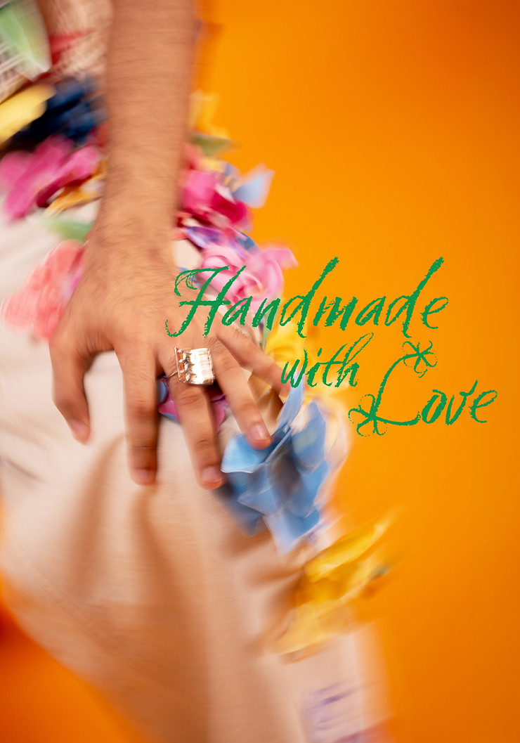
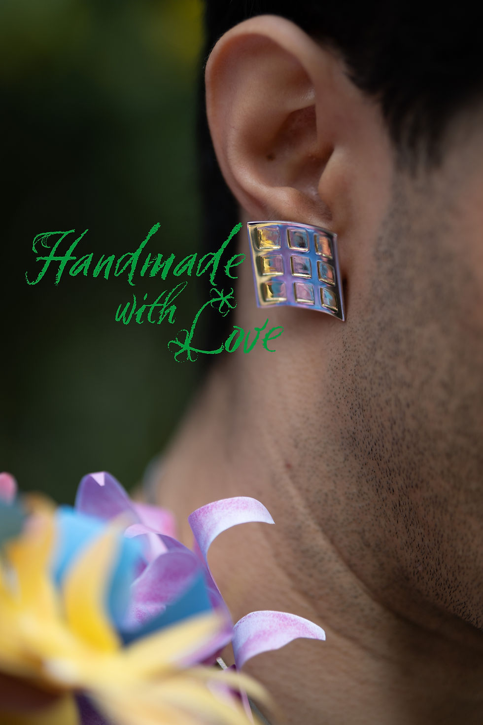

The identity was set in Six Hands, a chalk-style typeface, chosen for its handmade texture. I added the flower and leaf embellishments and composed the final layout. The identity ran across Maison Megh's social media and website.
Photography by Aditya Dinesh Jayan.
02 . 523 Flowers and 117 Leaves
Illustration with soft pastels | Paper Engineering | Set Design


Soft Pastel Illustration Scans
3D Flowers
Each flower and leaf started as an hand drawn illustrations using soft pastels. Then they were scanned, printed, cut, and shaped. The flowers were then stuck to the chair and clothes using glue drops.
The illustrations were done by me, a team of four joined for the cutting and construction.


Videography by Namrata Khera and Aditya Dinesh Jayan.
Reels Edited by Aditya Dinesh Jayan.
03 . Tic Tac Toe Ring Board
Prop Making I Video Editing I Sound Design


While Creating the tic tac toe board, I tested out a lot of different papers. These scans show the range of opacities and weights explored while making the board. They were scanned in this way to explore how the cutouts and layers could form patterns.

A ring holder reimagined as a tic tac toe board. Built from thermocol, red chart paper, acetate, and white permanent marker. Each layer cut and assembled by hand, dimensions templated first in Illustrator to get the ring fit exact. Played out as a game, showing everything is fair in love and tic tac toe.
Videography by Namrata Khera
Edited by me
Material Study
04 . Condom Wrapper
Prop Making I Paper Engineering I Video Editing | Art Direction
A ring packaged as a condom. The wrapper was hand-built from silver foil paper, folded into a pocket that opens to reveal the ring inside. The condom outline was shaped from tissue paper, coiled to get the form right.


Main Reel
Videography by Aditya Dinesh Jayan
Edited by me
Art Direction by Meghna Ratra
Instagram Story 1
Videography by Aditya Dinesh Jayan
Edited by Aditya Dinesh Jayan
Art Direction by me
Instagram Story 2
Videography by Aditya Dinesh Jayan
Edited by Aditya Dinesh Jayan
Art Direction by me
Paper Engineering I Pattern Design | Art Direction
05 . Unfolding


Patterns
Final Look
The act of opening a gift itself. A paper pentagon that blooms open to reveal a necklace.
Five panels unfold outward from the centre, each one opening to the next in a sequence designed to show the anatomy of an Amla — the fruit that inspired the jewellery collection. When closed, the panels form a single photograph. The concept and art direction were entirely mine, inspired by Jasmine Dowling's paper engineering technique. The structural challenge was getting five panels to overlap to form a single image. I created multiples prototypes in paper before the fold sequence worked correctly.

Videography by Aditya Dinesh Jayan
Edited by Aditya Dinesh Jayan
Art Direction and concept by me